FIGMA
CLAUDE
2024
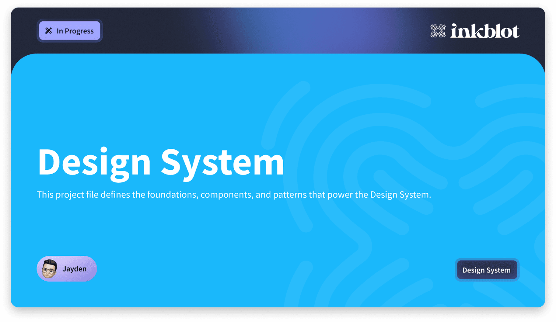
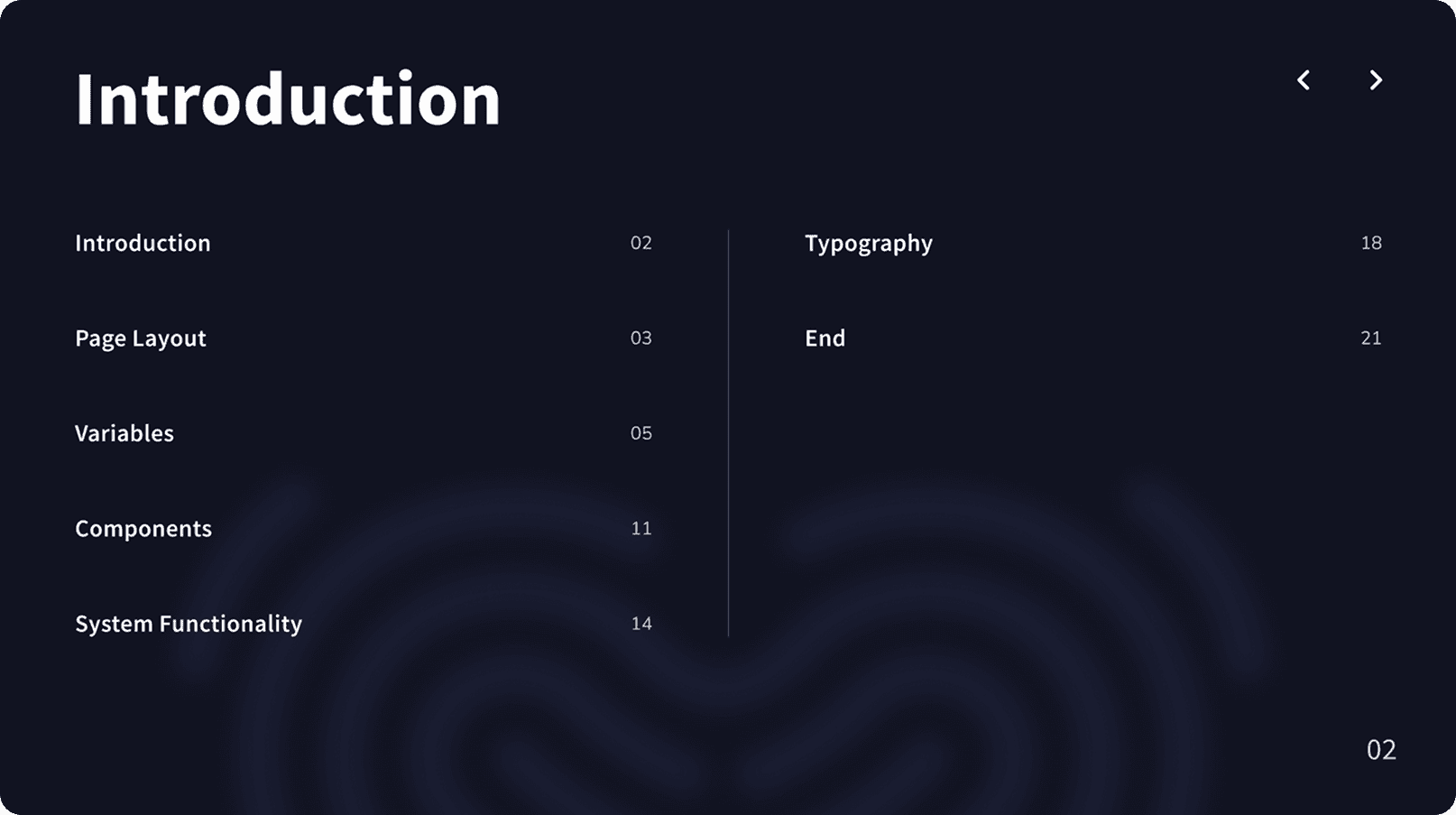
Design System
A design agency with three designers, two developers, and a sister dev company, but no shared design system. Components were scattered, states were undocumented, and time-billed projects were burning hours rebuilding the same things. I decided to fix that.
My Role
Sole Designer
System Architect
Status
Live
Ongoing
People that utilising the DS
3 Designers
2 Developers
Sister Dev Company
2 Brand Designers
The Mission
No system. No consistency. No time.
When I joined as a junior, some projects had components built ad-hoc, others used community systems that didn't quite fit, and none of it talked to each other. Every new project meant rebuilding or hunting down what a button's hover state was supposed to look like. On hourly-billed work, that inconsistency has a direct cost. I saw it early and decided to fix it. No one asked me to.
Key Insight
The biggest drain wasn't design. It was communication.
Without documented component states, designers and developers were spending time in back-and-forth that shouldn't have existed. What changes when a field is disabled, Focused, ect? These are questions a good design system answers before anyone has to ask them.
Key Insight
The community template was a starting point, not the answer.
I chose a Figma community template for its solid component catalogue and prototype linking. But it had no variables, text styles, or consolidated logic. Separate components, all doing the same job. That needed fixing first

The Solution
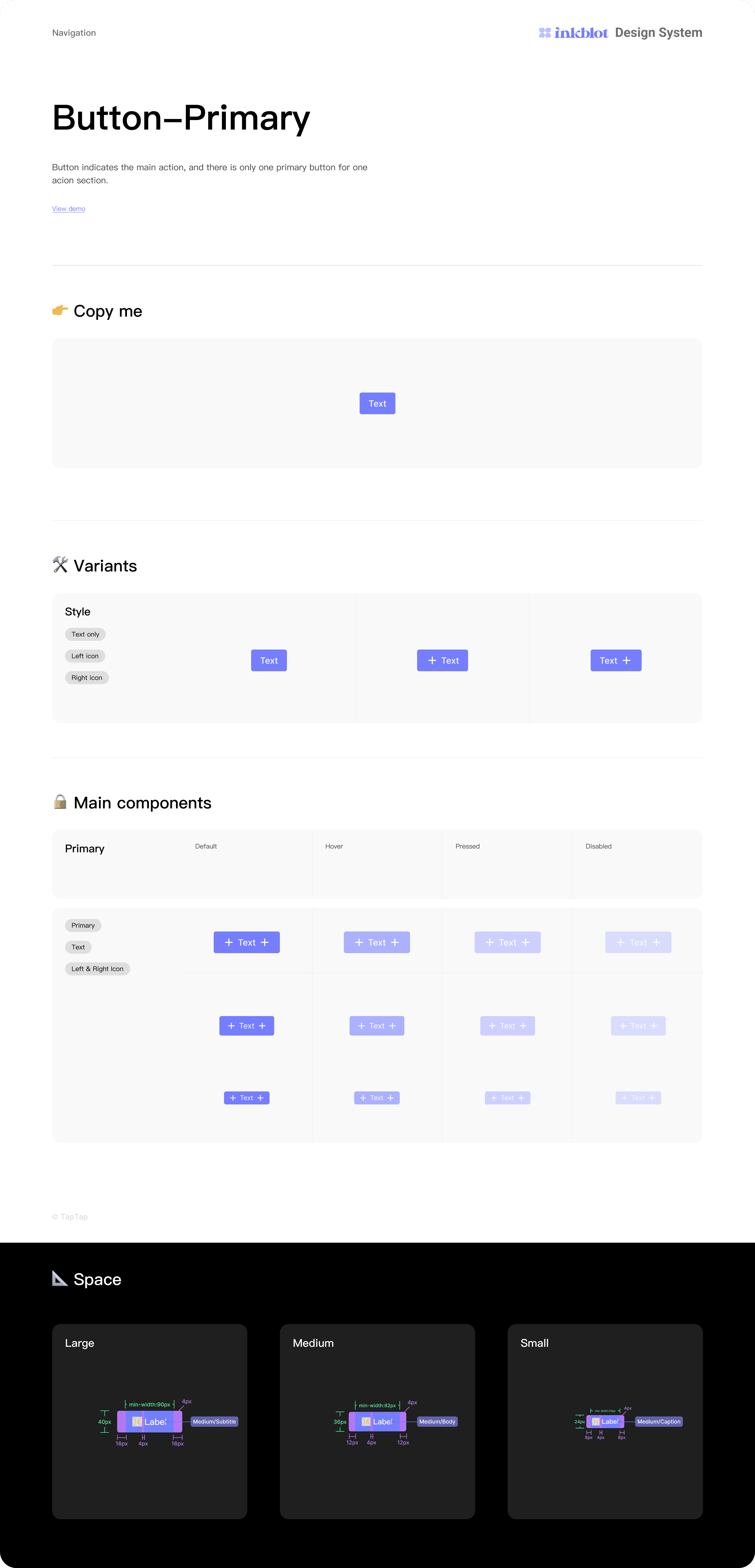
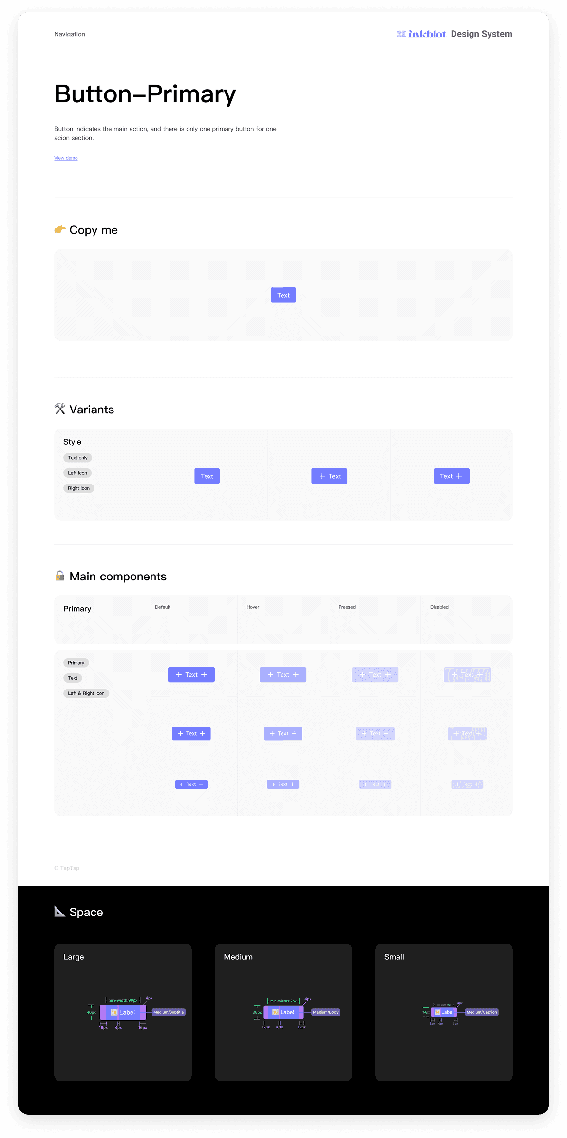
Variables that change the whole brand - in one click.
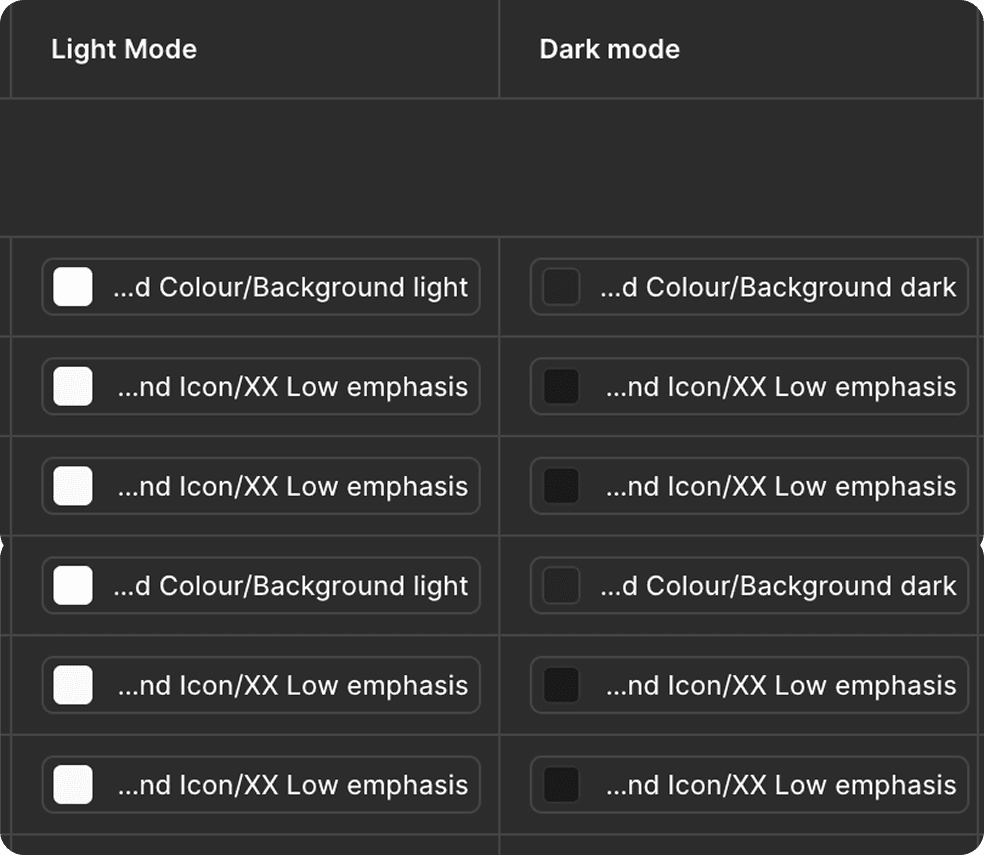
I built the variable system in layers: Primitives as raw values, Tokens as semantic references, and Typography and Value collections on top. Every component in the system is wired to tokens. The result: swap the brand colour in one place, and it propagates across the entire system, every component, every state, light and dark mode both.
This also made light/dark mode a structural feature, not an afterthought. Both modes are built into the token layer and switch reliably across every component.

The Solution
Tne system became two - on purpose.
The original plan was one comprehensive system covering everything. But a large Figma library takes time to import into project files, and a website project doesn't need application-level components. I split the system into two versions to solve this without creating duplication overhead.
Version 01 - Website
Core UI components
Optimised for marketing/web projects
Version 02 - App & Web
All website components included
Application-specific components
The two systems share the same token and branding foundation, so a designer or developer never has to reconcile two different brand implementations. If a project spans both app and web, everything still speaks the same visual language.
The Solution
A system no one understands is no system at all.
Because the system introduced a lot of new tools: variables, token-driven theming, component toggles. I built a dedicated documentation page directly inside Figma explaining how each feature works. Then I made a video tutorial and ran the team through it in person.

Research & Process
Bridging the gap.
The team mapped out pain points and missing features, internal, honest, and direct. The loudest signal came from the developers. Not about aesthetics, but ambiguity. Missing states, inconsistent naming, no clear handoff language. I prioritised learning how they think, how they read a component, and what makes one painful to build. The goal was a shared language both sides could use and learn from
Design Decisions
Ten components collapsed into one.
When I joined as a junior, some projects had components built ad-hoc, others used community systems that didn't quite fit, and none of it talked to each other. Every new project meant rebuilding or hunting down what a button's hover state was supposed to look like. On hourly-billed work, that inconsistency has a direct cost. I saw it early and decided to fix it. No one asked me to.
The Outcome
Stress-testing it. Then taking it further.
The system is now in active use and being stress-tested through real projects. Most updates at this stage are refinements, components that need adjusting based on what actually gets used in production.
“Understanding the developer mindset, not just designing for it, is the next thing I want to build.”
Personal direction, 2025
I'm currently exploring vibe coding and working towards integrating the system into developer tooling like Lookbook. The goal is to bridge the gap between the Figma system and developer implementation, so the handoff isn't just visual references, but a living connection between design and code.
Key Learnings
What I'd tell myself at the start.
Build the infrastructure first. Text styles, variables, tokens, before touching a single component. Adding them retrospectively meant clicking through every individual component to wire up connections. It was tedious and time-consuming in a way that was entirely avoidable.
Onboarding is part of the system. A design system that the team can't navigate confidently doesn't deliver its value. The video tutorial and documentation page weren't extras, they were essential deliverables, and I'd plan for them from the beginning next time.
Taking initiative as a junior to build something the company didn't ask for is only valuable if it holds up under real project conditions. Shipping early and stress-testing it live was the right call, it surfaced real problems faster than any internal review would have.


" height="28.999999886972084px" id="eBK7ueKBT" width="123.0000019796106px"/></svg>)
" height="30.000000522179104px" id="pq5iJcqi1" width="169.00000138015207px"/></svg>)